Creating an accessible design system
How do you turn a platform riddled with tech and design debt into a AA-accessible marketplace for tens of thousands of workers displaced by COVID? Build a design system.

How do you turn a platform riddled with tech and design debt into a AA-accessible marketplace for tens of thousands of workers displaced by COVID? Build a design system.
My role during this project was IC Product Designer working with Engineering to establish our design system at Sidekicker.
When I joined Sidekicker, I inherited a product that was a mess of inaccessible and inconsistent styles, components and patterns. Not through anyone’s fault. It was just the nature of a product that had only recently found its market fit. I saw a clear opportunity for developing a design system, the business just needed convincing.
At the start of COVID, Sidekicker signed an agreement with the Victorian Government to deliver the Jobs Victoria marketplace, a place for people who had lost their jobs to find employment. At its peak we had 20,000+ Victorian’s signed up searching for jobs.
A key requirement from the Victorian Government was that the marketplace follow WCAG AA guidelines. Given our existing platform was completely inaccessible, the opportunity to develop our design system had arrived!

The original Sketch library that I inherited when I joined Sidekicker.
Our design system would need to satisfy the following criteria:
I also saw it as a means to resolve some of the existing design debt, like our lack of an 8pt grid, our weird and wonderful colour palette and typography, and of course a platform filled with one-off, inconsistent and disconnected components.
Given the magnitude of what we were undertaking and our limited resources we didn't undertake any generative research or user testing. I’d never created a design system from the ground up, but the great thing about design systems is that there are hundreds of examples to browse!

Some of the designs systems I used for inspiration.
I worked closely with engineering to understand not only the best form for different components to take, but also how best to implement them in a lean and reusable way. It helped considerably that I had experience building my own React apps, so I had a solid understanding of how the components would be put together. We took a progressive approach, building out components as needed. We included only the essential functionality to fit the use case, plus future use cases we had a high level of confidence would be needed in the not too distant future.
One of the biggest areas of learning came from ensuring the design system met the WCAG AA requirements. I again worked closely with engineering to understand these requirements, implement solutions and then QA what was built. I learned a lot about designing an experience that could be used by all users.
A few of the things I learned:

Keyboard navigation of the select component was an example of some of the complexity we had to navigate.
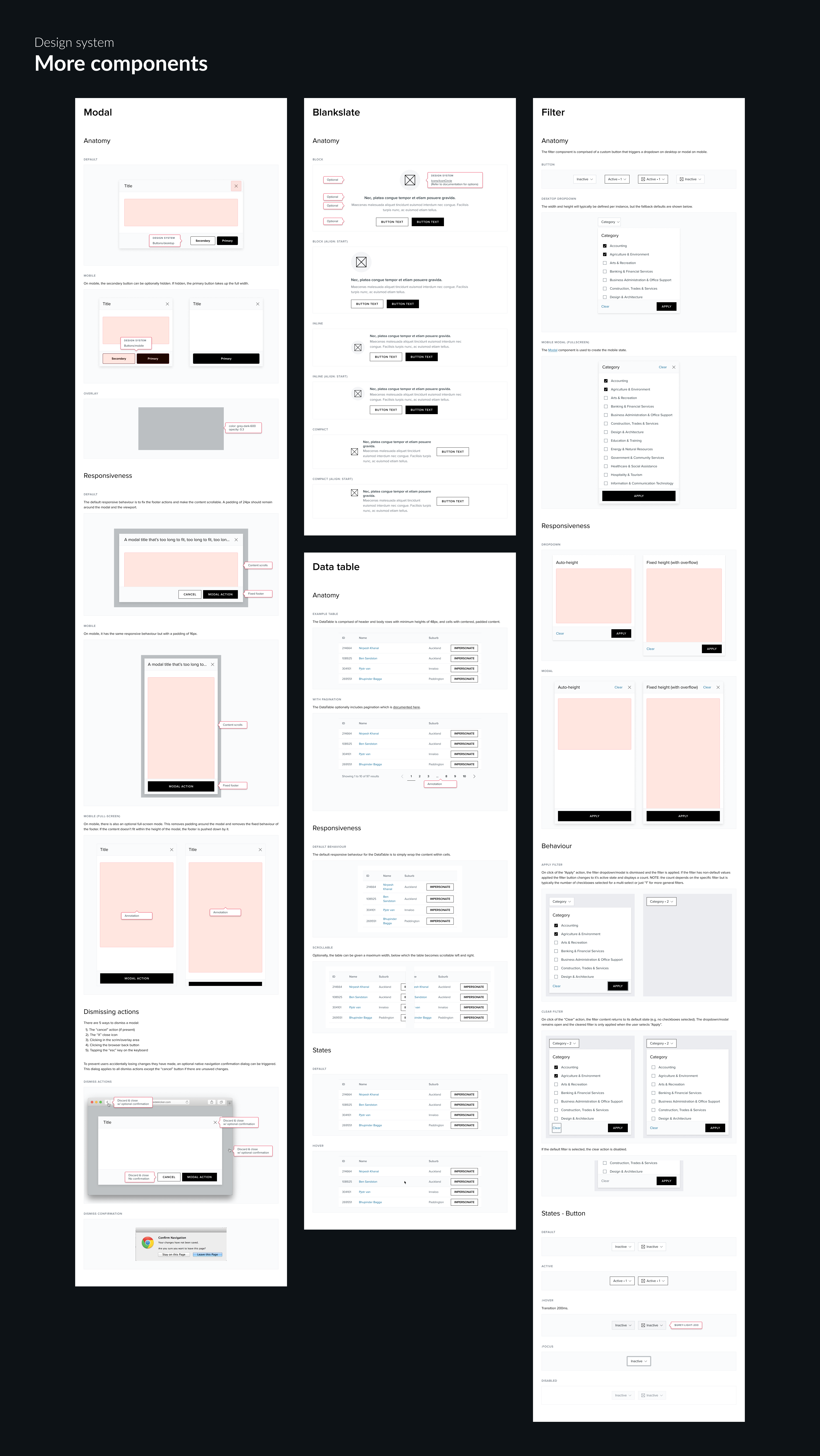
Documentation of the design system was done in Figma and used as both guidelines for usage as well as to document the production designs.
And finally, there was the important task of naming our design system. I dug into the database and found the first job that was ever completed by a worker, who went by the name “Mari”.

Check out our production version of Mari on Storybook: https://mari.sidekicker.design/
In terms of the original goals we set out with, the results have been clear:
Following on from this project, I established a distributed design system team to provide ongoing governance and continue to improve it. We haven’t reach the scale we need as a business to warrant major ongoing investment in it or a dedicated design systems team, but we still take any opportunity we get to continue to improve it.
A design system can be what you make it. Even the smallest start-up will benefit from thinking in design system terms. You don’t need a major upfront investment, or a centralised design systems team - you can just start with a button. We took a lean, progressive approach and managed to build out a strong foundational design system in a relatively short amount of time.
Hero image by Mourizal Zativa on Unsplash


Message me on LinkedIn →
Or email me at patrick.morgan@live.com.au →